Day 45: the latency-throughput curve, and the knee as arithmetic
Date: 2026-08-27 · Week 12 · Phase 5 Benchmark and optimize
What I added today
nanoserve.curve, which closes Week 12 by drawing it: OperatingPoint for one setting and the two numbers it produced, dominates for the only ordering this module has, TradeoffCurve with frontier, dominated, peak, knee, found_the_wall and knee_bracketed, Segment for what one notch of the knob cost and bought, capacity_under_slo for the question capacity planning actually asks, check_swept_to_saturation and check_same_axes for the two gates, point_from_load_report and point_from_run for the bridge from Day 42’s and Day 44’s report objects, and cell_for plus render for an ASCII plot whose every cell is arithmetic the suite can assert on. curvebench.py at the root reads the two CSVs the week already wrote and emits day-45-curve.csv. tests/test_curve.py is 66 tests in four tiers, one of which points the knee finder at an M/M/1 queue whose answer is known in closed form. Suite 911 green (5 GPU-gated skips), ruff clean.
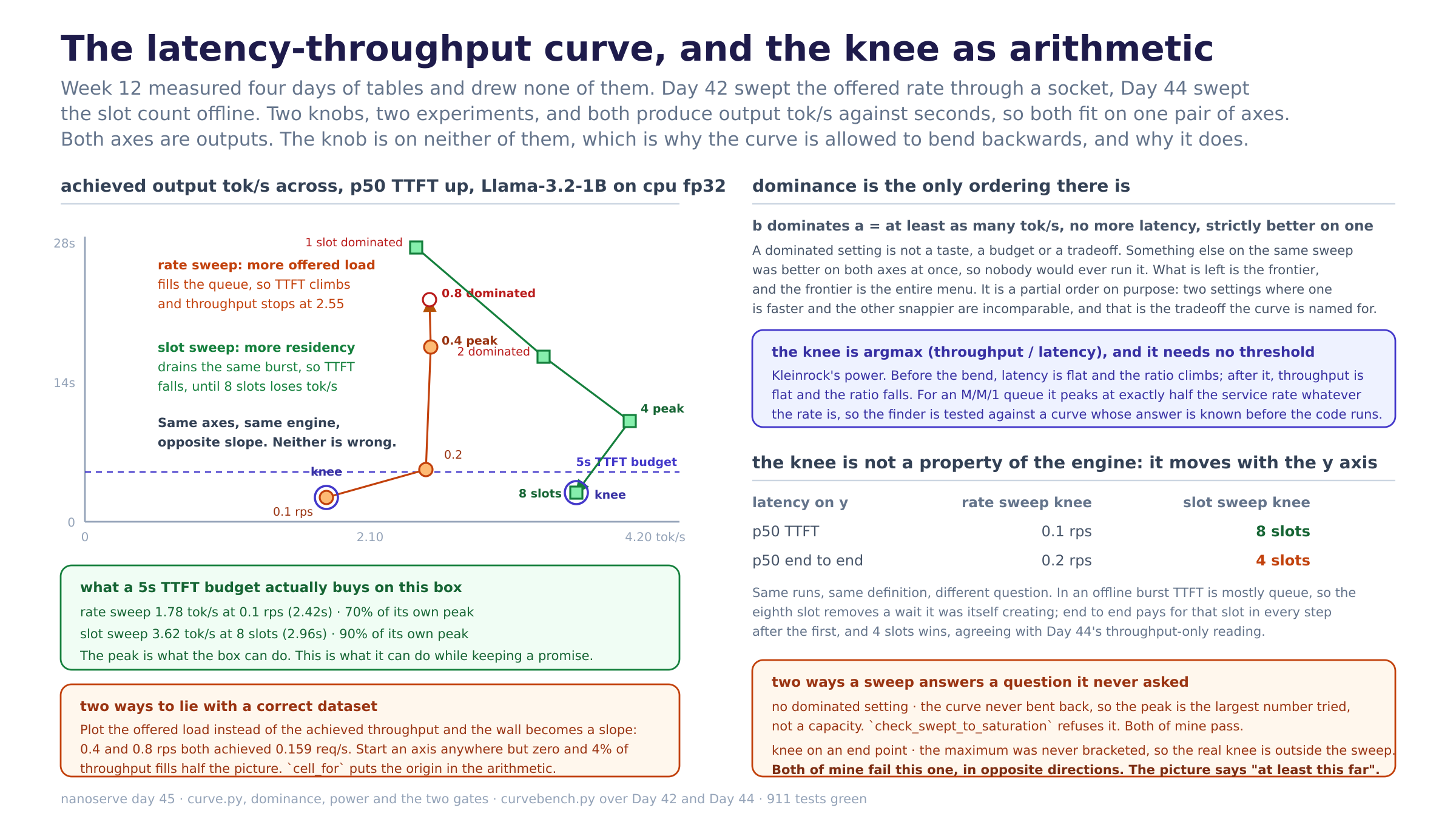
Nothing was measured today. Day 42’s open-loop rate sweep and Day 44’s offline slot sweep, on one pair of axes, achieved output tokens per second across and p50 TTFT up:
setting     tok/s   TTFT     power   verdict
0.1 rps      1.78    2.42s   0.736   frontier, knee
0.2 rps      2.51    5.23s   0.480   frontier
0.4 rps      2.55   17.49s   0.146   frontier, peak
0.8 rps      2.54   22.26s   0.114   dominated by 0.4 rps
1 slot       2.44   27.57s   0.088   dominated by 2 slots
2 slots      3.38   16.53s   0.205   dominated by 4 slots
4 slots      4.01   10.14s   0.396   frontier, peak
8 slots      3.62    2.96s   1.223   frontier, knee
Two knobs, one pair of axes, and they trace it in opposite directions.
Why it matters
The curve is parametric, and that is the entire reason it is worth drawing. A plot of y against x is a function: one y per x, left to right, forever. This is not that. Throughput is on x, latency is on y, both are outputs, and the knob that produced them is on neither axis. So the curve may bend backwards, and both of mine do: the rate sweep goes almost straight up at the end (0.4 to 0.8 rps buys 4.77 more seconds of TTFT and gives back 0.01 tok/s), and the slot sweep turns left at the end (8 slots is 0.39 tok/s below 4). A table can hold that and a function cannot, which is why the wall is invisible in a table and unmissable on the picture.
Dominance is the only ordering, and it is deliberately partial. b dominates a when it delivers at least as many tokens per second at no more latency and strictly beats it on one of the two. A dominated setting is not a preference or a budget, it is a wasted run: something else on the same sweep was better on both axes at once. Three of my eight settings are dominated, and 0.8 rps is the one that matters, because it is the row a benchmark quotes as “the highest load I tested”. The rest of the points are incomparable to each other, which is exactly right: no amount of arithmetic decides whether 4.01 tok/s at 10.1s beats 3.62 at 3.0s, because that trade is the caller’s and a total order would need a number saying how many seconds a token per second is worth.
The knee is argmax throughput / latency, and needing no threshold is the point. That ratio is Kleinrock’s power. Before the bend, latency is roughly flat and the ratio climbs with throughput; after it, throughput is roughly flat and the ratio falls as latency runs away, so the maximum is where the two regimes meet. The alternative definitions all smuggle in a parameter (“the knee is where latency passes twice its unloaded value”), and the parameter then decides the answer. Power’s units are tokens per second squared, which nobody has an intuition for and which does not matter, because it is only ever compared inside one curve.
capacity_under_slo is a different number from the peak, and it is the one worth publishing. Under a 5s p50 TTFT budget the rate sweep serves 1.78 tok/s, which is 70% of its own peak, and the slot sweep serves 3.62, which is 90% of its. The peak is what the box can do with every caller waiting as long as it takes; this is what it can do while keeping a promise. Reporting the first and advertising the second is the standard way a serving benchmark stops reproducing in production, and it is one line of code apart.
What I learned
- Both of my sweeps put the knee at an endpoint, which means neither of them found it. The rate sweep’s knee is 0.1 rps, its first setting; the slot sweep’s is 8 slots, its last. Power rises to the knee and falls after it, so a knee sitting on the edge of a sweep is not a maximum that was located, it is the place the sweep stopped. The real one is outside, and the honest reading is “at least this far” in both cases. That is a second, symmetric version of the gate the day already had:
check_swept_to_saturationcatches a sweep that stopped before the wall on the right, andknee_bracketedcatches one that started after the knee on the left. I only noticed because the plot put a marker in the corner, which is a decent argument for drawing things. - The knee is not a property of the engine. It moves with the y axis. Same eight runs, same definition, one substitution: with p50 TTFT on y the slot sweep’s knee is 8 slots, and with p50 end-to-end it is 4. Both are correct. In an offline burst every prompt is handed over before the first step, so TTFT is mostly queue, and the eighth slot removes a wait that the seven-slot configuration was itself creating. End-to-end pays for that slot at every step after the first, so it lands on 4 and agrees with Day 44’s throughput-only reading of the same data. “Where is the knee” is not a question until the y axis is named.
- An M/M/1 queue has no dominated points, and a real engine does. In M/M/1 latency runs to infinity but throughput never falls, so nothing is ever worse on both axes and the frontier is the whole curve. Every backward bend in a measured curve is therefore something the queueing model leaves out: rows in a batch competing for the same arithmetic (Day 44’s second factor), a preempted sequence recomputing its prefill (Day 34’s), a KV pool that ran out. The dominated region is not noise around the model, it is the part of the system the model does not contain.
- The analytic test is worth more than the twenty measured ones. M/M/1 with service rate mu has power
lambda(mu - lambda), maximised at exactlymu/2, a utilisation of 0.5 whatever mu is. So the knee finder can be pointed at a curve whose answer was known before the code existed, and the test asserts 0.5 at two different service rates. Everything else in this module is checked against points I placed by hand, which proves the code does what I meant; this one proves what I meant was the standard thing. - Half of the slot sweep’s steps are free, and my queueing intuition said they could not be. Going 1 to 2 slots buys 0.95 tok/s and gives back 11.0 seconds of TTFT; 2 to 4 buys 0.63 and gives back 6.4. Both axes improve, so the earlier setting is dominated outright, and pricing the step in seconds per token per second produces a negative number that sorts the best steps to the bottom of a column.
Segment.freesays so instead. It happens because the burst arrives all at once, so a request that is not resident is not “arriving later”, it is already waiting, and a slot that admits it removes queue time without adding anything. On an open-loop sweep, where load actually arrives over time, no step is free, and the rate sweep has none. - The two ways to draw this wrong are both ways to be wrong with correct data. Plotting latency against the offered rate instead of the achieved throughput stretches the wall into a slope, because past capacity the offered rate keeps rising while nothing else does: 0.4 and 0.8 rps both achieved 0.159 req/s and would sit at different x positions. And an axis that starts anywhere but zero turns the 4% between 2.44 and 2.55 tok/s into half the width of the picture. Neither is a bad measurement, and both are read by everybody who does not check the tick labels, so the origin is inside
cell_for’s arithmetic rather than a flag on it. - The most expensive notch on either sweep costs 306 seconds per token per second. 0.2 to 0.4 rps bought 0.04 tok/s for 12.26 more seconds of TTFT. That is the segment where the queue took over, and it is a single number that says so without needing the shape at all. It sits right next to a step that cost 3.85, which is what a knee looks like when you price it one notch at a time.
Diagram
latency-throughput-curve.png. Left is the actual plot: both sweeps on achieved tok/s against p50 TTFT, with the frontier, the dominated settings, both knees and a 5s budget line, then what that budget buys and the two ways to draw it wrong. Right top is dominance and power as definitions, right middle is the knee moving when the y quantity changes, and right bottom is the two gates a sweep has to pass before its picture may be read.
Tomorrow
Week 12 is done: throughput and latency measured, an outside baseline, and the curve they trade along. Day 46 opens Week 13 on the factor this box has been losing on all week, the one Day 44 named and did nothing about: torch.compile on the decode step, with the per-step Python overhead and a profile behind it. Today’s curve is the before picture, so the first job is to be able to redraw it.
Post angle
Day 45 of building an LLM inference engine from scratch. I finally drew the latency-throughput curve, and the first thing it taught me is that it is not a graph in the sense I was using the word. Both axes are measurements. The knob I turned, offered load or slot count, is on neither of them. So the curve is allowed to bend backwards, and both of mine do: past capacity, turning the knob up buys latency and hands throughput back. That is the wall, and it is invisible in a table of the same numbers. The knee is argmax throughput / latency, which is Kleinrock’s power from 1979, and it needs no threshold: before the bend latency is flat so the ratio climbs, after it throughput is flat so the ratio falls. I tested it against an M/M/1 queue, where the maximum is provably at exactly half the service rate, so the finder has a right answer to be wrong about. Three things I did not expect. Both of my sweeps put the knee on an endpoint, which means neither sweep actually bracketed it, and all my picture can honestly say is “at least this far”. The knee moves depending on which latency is on the y axis: with TTFT the slot sweep says 8 slots, with end-to-end it says 4, same eight runs, both correct, because in an offline burst TTFT is mostly queue and the eighth slot removes a wait it was creating itself. And an M/M/1 queue has no dominated points at all, so every backward bend in my measured curve is exactly the part of my system the queueing model leaves out. Also: peak throughput and throughput under a 5s TTFT budget are different numbers, 70% apart on one of my sweeps, and quoting the first while advertising the second is how a benchmark stops reproducing. 911 green.